
Just completed another MOC that I’ve been working on for quite a while. As usual, it seems like I’m always short of the pieces I really need and so, you’ll probably notice a few spots where this is the case.
The idea behind this MOC was to use the spiral step stairs and also create stairs leading down to a lower level like a lot of older brick and stone buildings. I also wanted to incorporate some “basement” windows. The sidewalk for this MOC starts off three bricks off the baseplate so if it were to be connected, one would need to grade up to this MOC. If I had enough LEGOs, I would certainly do so.
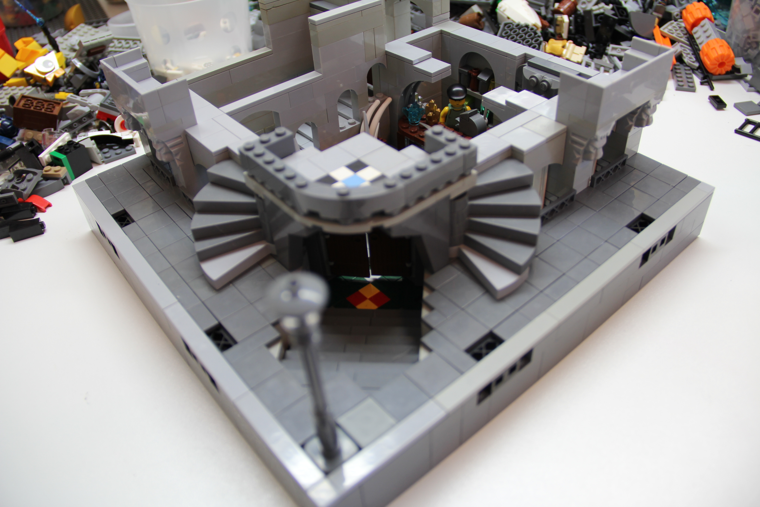
The Lower Floor, Basement or Cellar Store
There should probably be some sort of railing near the cavity where the stairs go down. Also, the angled bricks were not quite long enough to prevent that gap you can see there.

View from corner of bottom level

Front view of bottom level

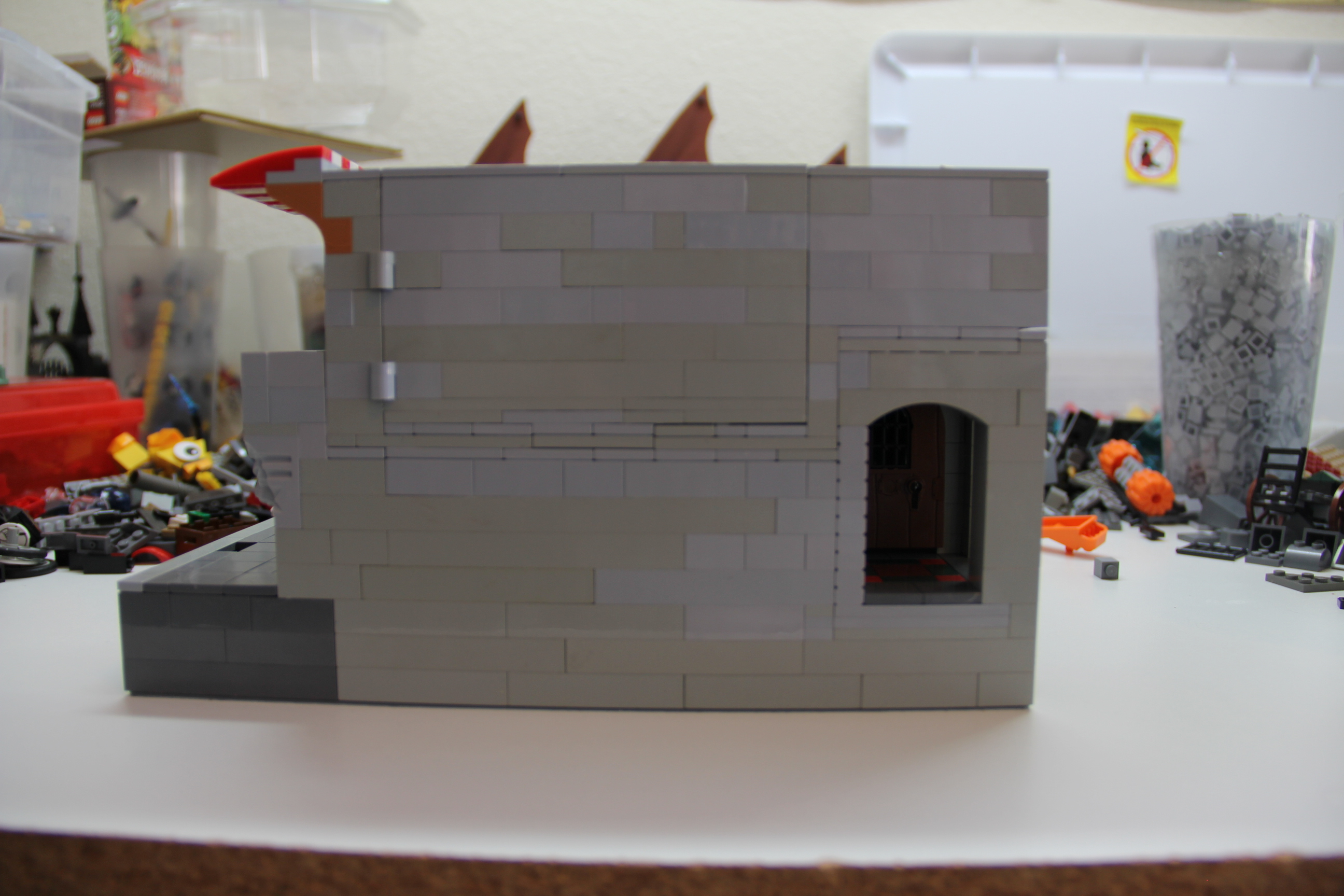
Side view of bottom level
Angled view of bottom level
I though I would do something different with the grates in this MOC. Ideally, I would have used the dark grey “headlight slot” bricks to fit in with the bottom colors. Also, if I had silver “fence” pieces to use for the grating it would look nicer.

Top down side view of bottom level
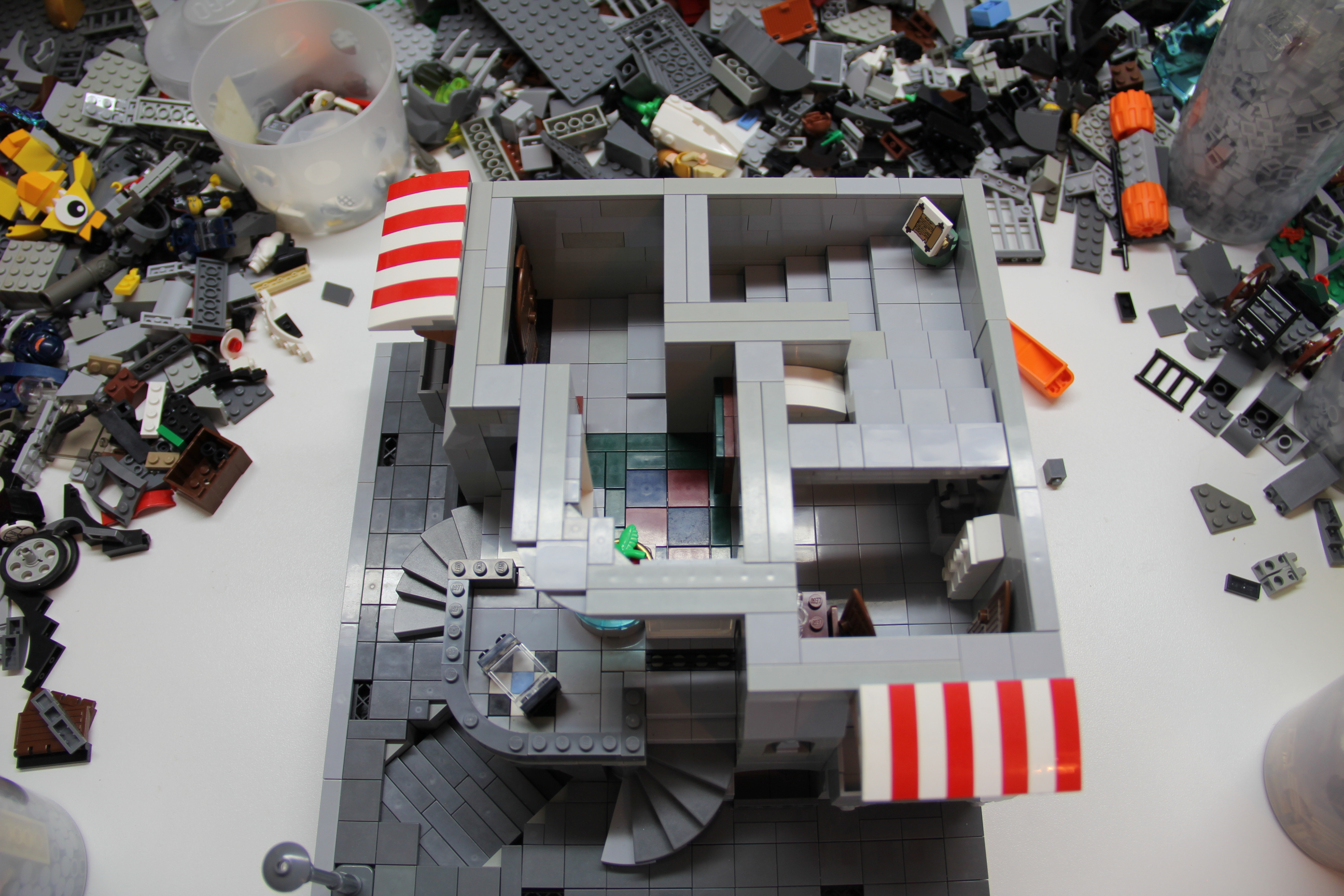
It would have been nice to have a cleaner break with the flat tiles at the top of the stairs.

Angled view of bottom level

Angled top down view of bottom level

Back view of bottom level
There is a “hidden wall” section leading to this tunnel that the rat is occupying, you can’t see it very well in the other pictures. It is behind the counter.

Angled side view of bottom level
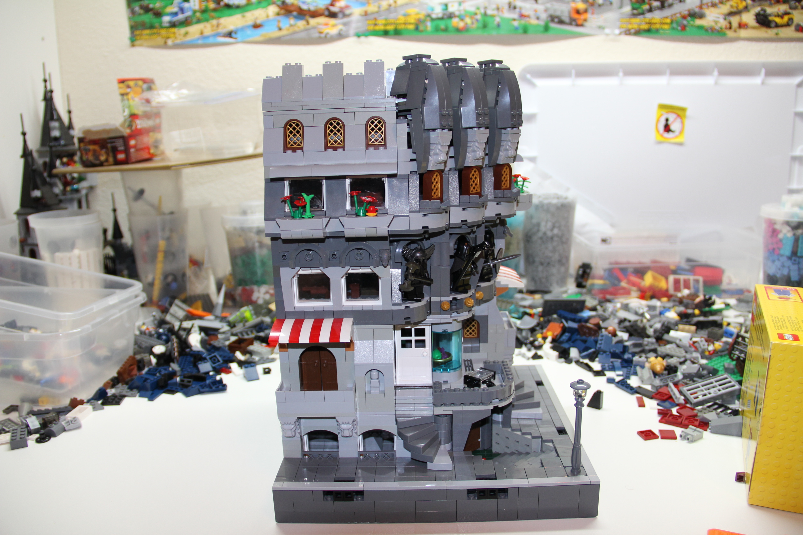
That’s it for the bottom level. The idea was a kind of basement level store, separated from the rest of the building. The stairs were a tighter fit than I had anticipated. I was constrained by the average sidewalk widths of the LEGO Creator sidewalks.
The First Floor
The original idea was to split the first floor into either two residences or two stores, but there just wasn’t enough space to do that. The back stairs eat up far more space than is necessary, but part of that was due to the basement floor stairs.

Angled view of first floor
The balcony turned out nicer than I thought as well as the rounded glass piece, although it does look a little wonky.

Front view of the first floor

Side view of the first floor
The little statuary portions didn’t quite work out the way I wanted, it’s a little too plain.
Top down front view of first floor
Not as much space here as I would have liked, but it still works.

Top down side view of first floor
Side view of first floor
Hinges for the wall leading to the “kitchen/dining” area. Of course, the hinges would have to go or be inset when lining it up with other sets.

Side view of first floor with opened wall
You can see parts of the kitchen here. You can also see how those stairs make it difficult to access this portion, thus the hinges.

Side angled view of first floor with opened wall
The rest of the “kitchen/dining” area with the stove and refrigerator. Originally, I wanted to put a full sized dining table in there, but there just wasn’t room.
The Second Floor
The second floor is the “living” area, it’s a more reasonable height as well. I went for a lot of different elements for the facade, some statuary and detailing. I did have enough grey frogs, but they are not all shown. I think the kids harvested them from the walls and I never located them afterwards.

Angled view of second floor
The statuary portions just barely fit into their cavities and they hide some of the necessary bridging and messy bits necessary to make the angles work. The little gold bits above the doors were originally going to be housings for some kind of canopy, but I gave up on trying to work it out.

Front view of second floor

Side view of second floor
You can see I had to move the grey frogs around to take the photos.
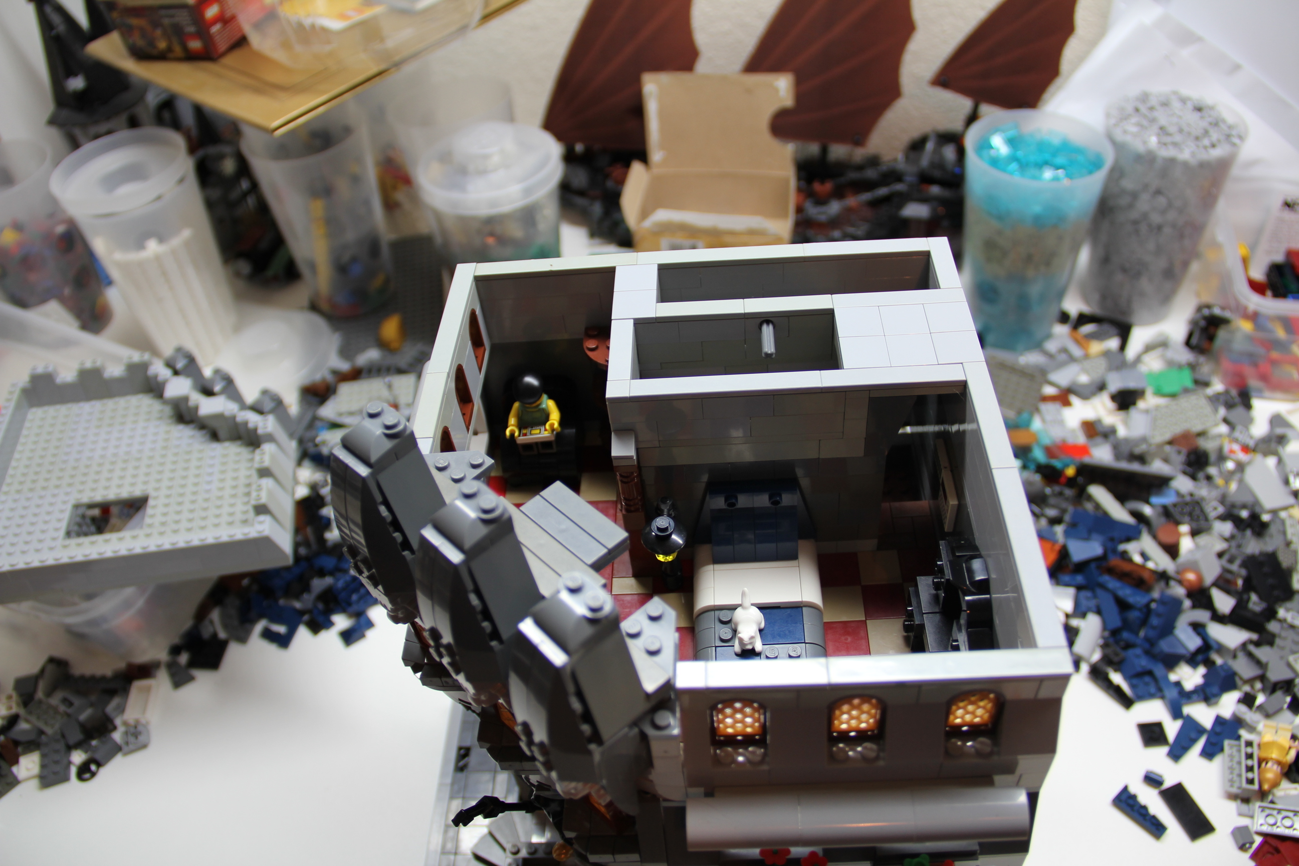
Top down view of second floor

Top down angled view of second floor
The TV actually rotates around for different “viewing angles”. It still looks pretty sparse.

Top down angled back view of second floor
Those square things behind the couch are supposed to be “pictures” of some sort. The little grey drawers under the windows were necessary as I didn’t have enough grey 1×2 flat plates to finish the tiling.
The Third Floor
This is the “bedroom” space. This level was the most difficult level to finish off for a variety of reasons. The angled front with the lions were not easy to finish, they constantly broke off and required some complicated bridging to make work. Also, because of the height and the way I build, it was very difficult to lay the tile in the “walk-in closet”. If I knew how I was going to finish it off, I would have laid the tile before it got so tall or closed in.

Angled front view of third floor
I think the lion and window combination worked out well over the statuary portions.

Front view of third floor
Side view of third floor
Angled front view close up of third floor
The middle portion under the window is actually sitting loose and not tied in to the floor at all, it has to slide in just right to hold it still.

Top down side view of third floor
The angled portion is rather messy, but necessary for the roof to fit right.

Top down front view of third floor
You can see how I ran out of 1×2’s in the right color, but it isn’t too noticeable (unless I point it out). The grey rod is there to hold the roof trap door in place which comes down into “walk-in closet”. Probably would have been better to turn that into a bathroom now that I think about it.

Angled top down front view of third floor
Most beds have a cat in it, my wife can attest to this fact of life. The bed seems larger than most, but it fits.
Top down front view of third floor
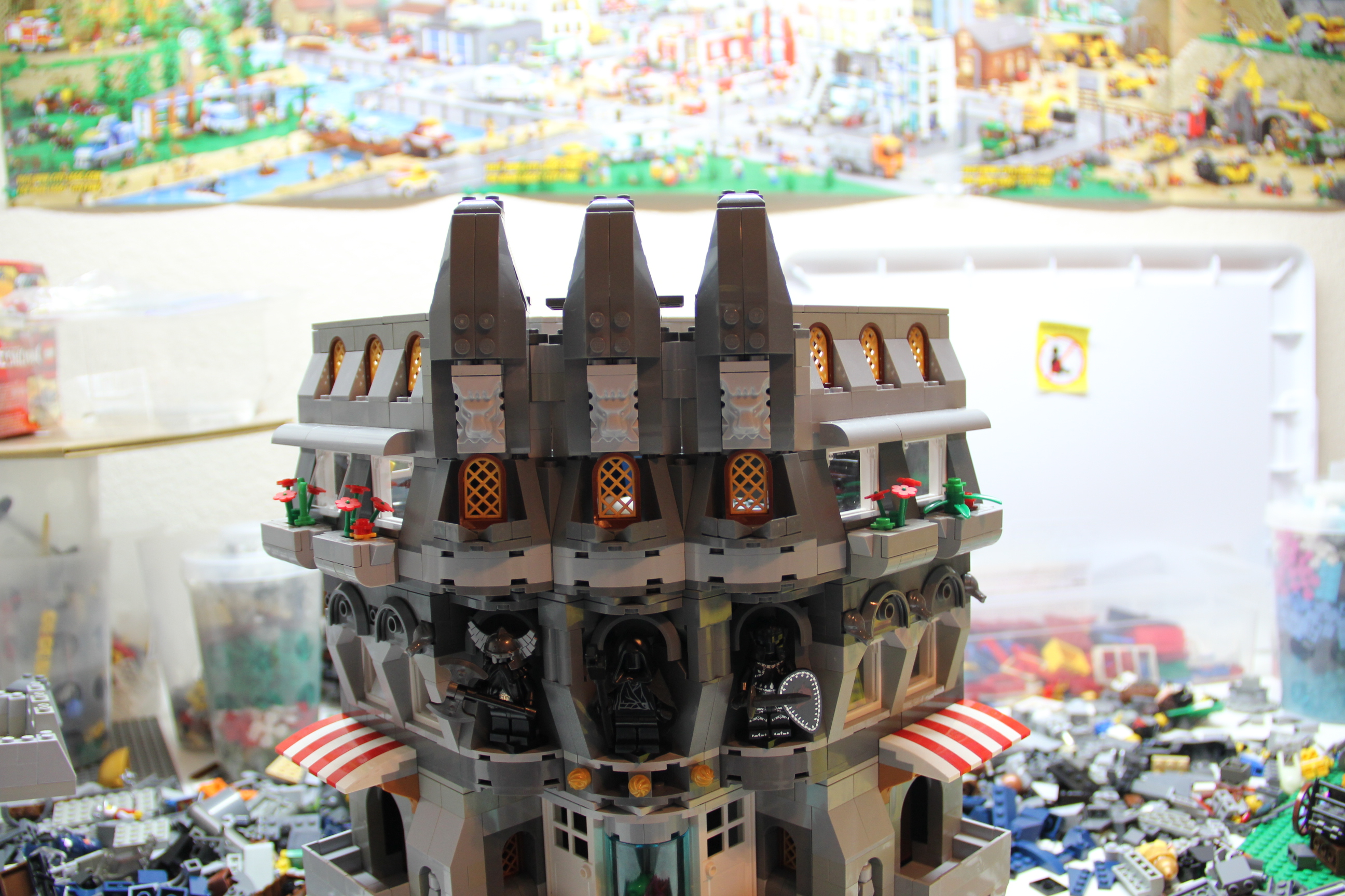
The Rooftop Level
Rooftops are usually pretty boring. I tried to do something different with the rooftop here, but had to abandon it…not enough pieces in the right colors…or patience.

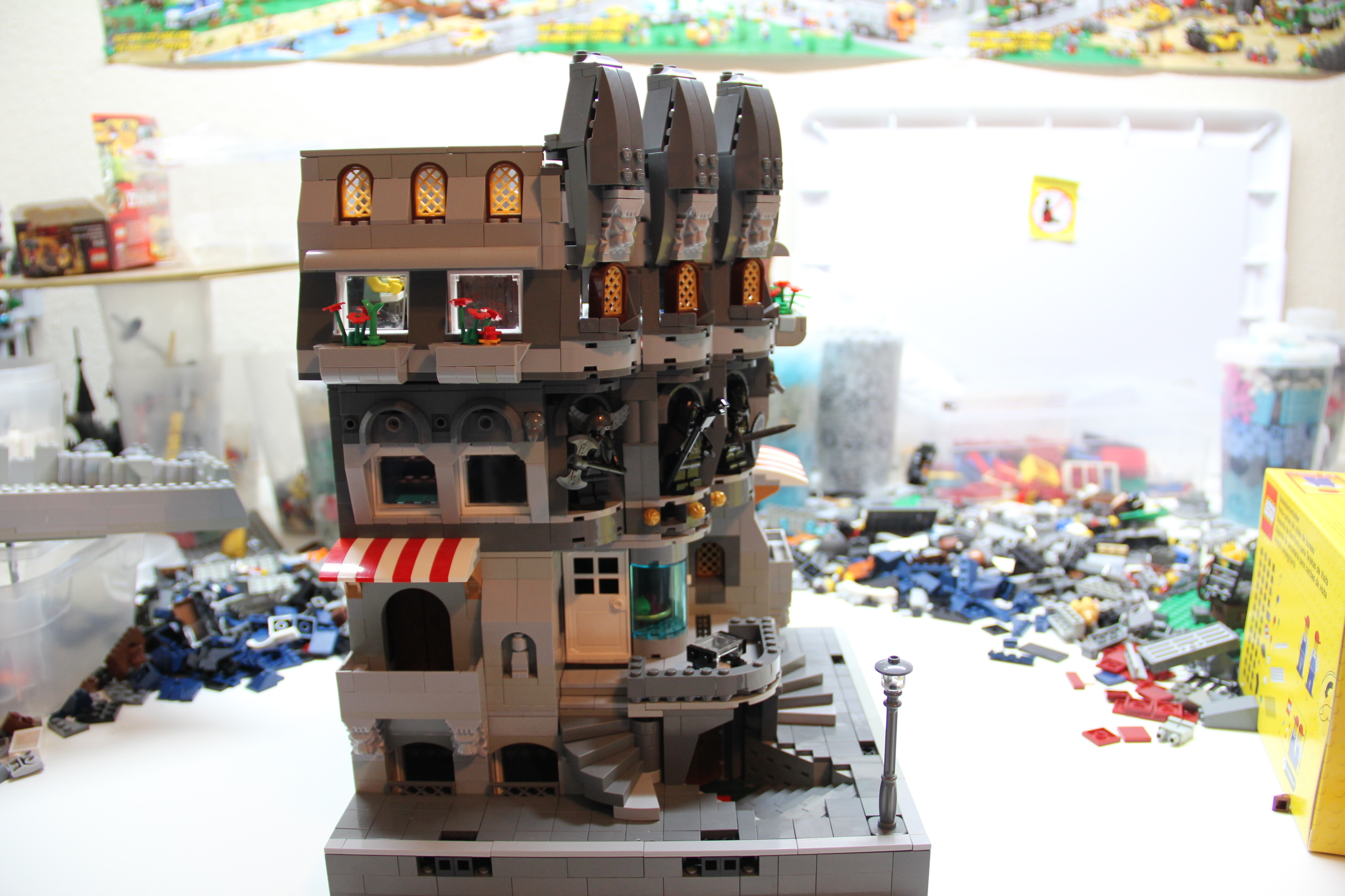
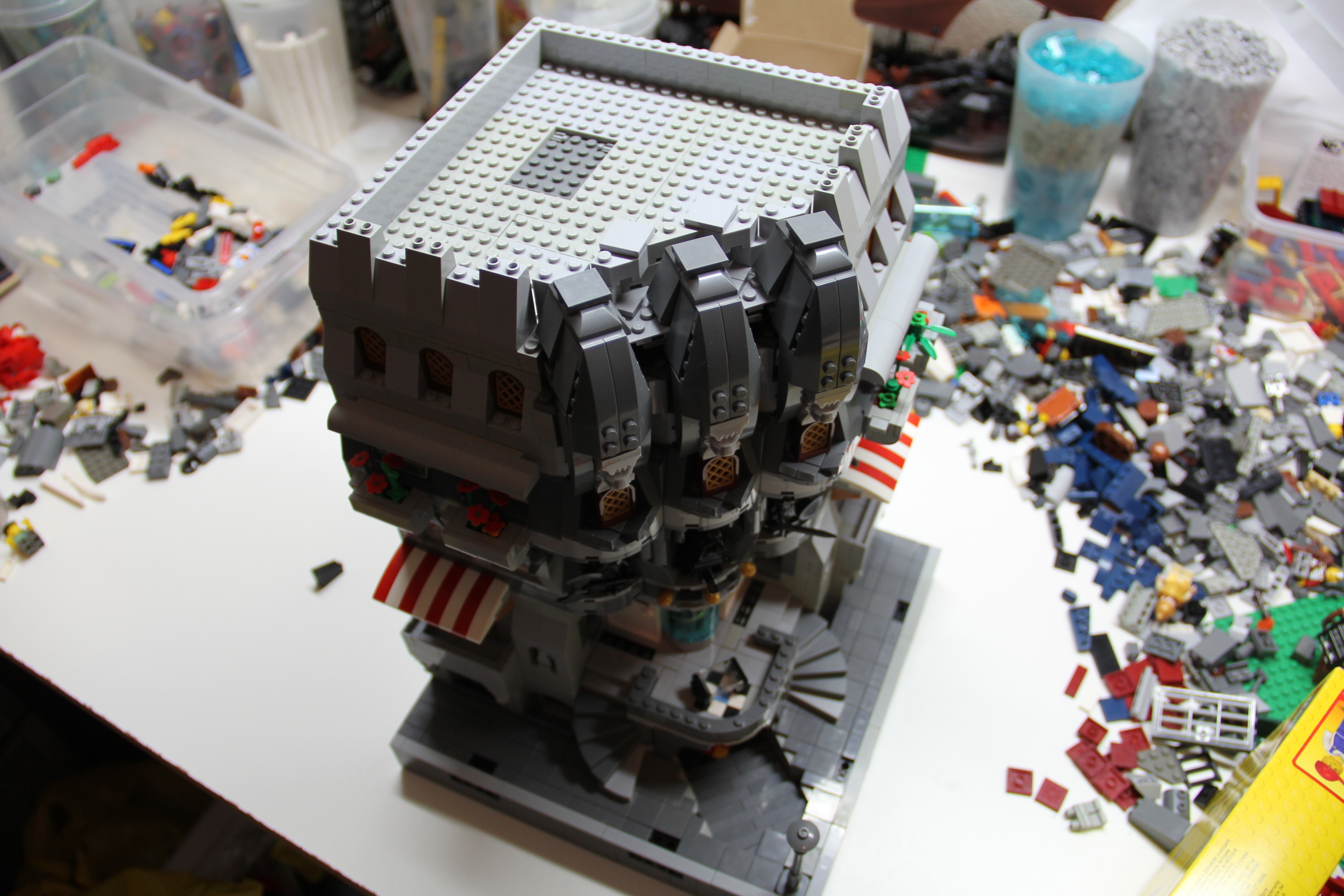
Angled front view with rooftop
Doesn’t look too bad from this angle, the sloped crenelations help.

Front view with rooftop level
Side view with rooftop
Angled top down view with rooftop

Angled top down front view with rooftop
Originally, I was going to extend the dark grey portions back further onto the rooftop but the angles made that too difficult. Not to mention lack of pieces in the right colors.

Angled back view with rooftop
Boring back and side view, but it is intended to have buildings flush against both sides. It also gives a sense of scale for the height.
All the Levels
All the levels removed and side by side, and a promise kept. Once finished, the kids get to play with it. I figure it will be disassembled at some point anyway.


Furniture
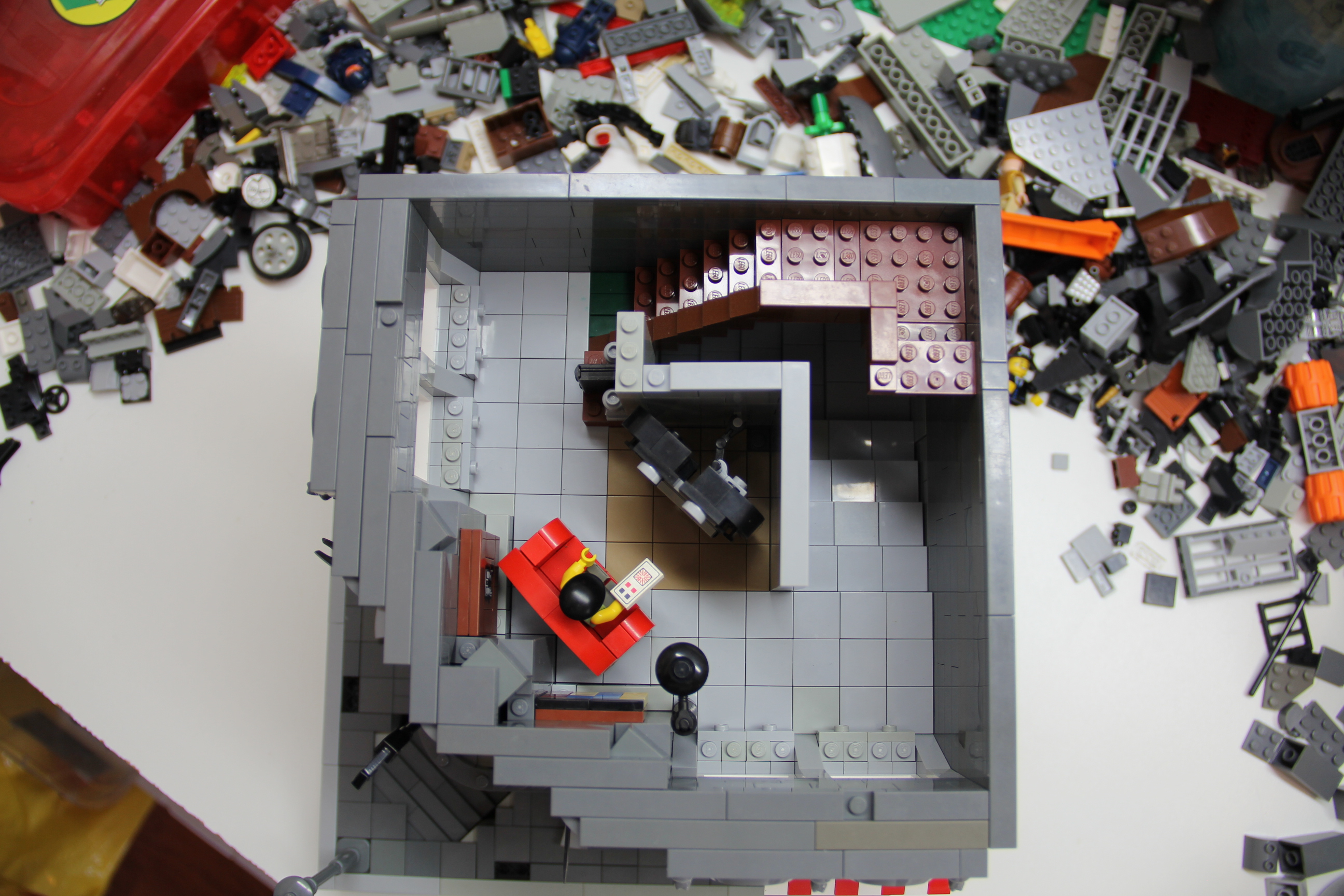
Some close ups of some of the furniture throughout the MOC.


