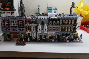
I’ve had some time to fiddle around with the Legos again. I designed this MOC to fit in with the LEGO Creator series; the floors line up and the sidewalks look similar. I tried to keep the style similar, however, I feel this one is lacking in the color department.
You can clearly tell which one is the MOC; a lot of grey and white. I think it is OK for a first shot at fitting in with the series. If the white portions were dark grey I’d be happier. Every city needs standard grey buildings, right?
I have since found the pieces to fill in the pavers, other than the roof being slightly higher, I think it fits in alright enough.
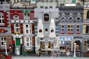
Pulled away, the white window bits seem a bit out of proportion. I’m not happy with the decorative blue parts on the white window elements, but I figured less would be more in this case than something overly complicated.
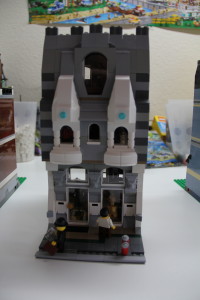
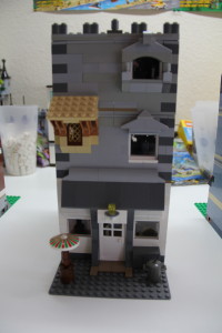
The rear needs some help. I was fiddling around with different window decorations and such. Most building rears aren’t very fancy as it is anyway.
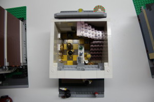
In hindsight, I should probably have done this Antique Shop with a larger baseplate as I ended up with more “antiques” than I thought I would.
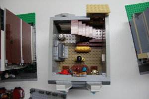
The furniture is rather sparse, but at least there’s something in there.
Supposed to be a kind of Proprietor’s area with the trap door and all. Still rather sparse and my furniture needs help.

